Timeline animation with HTML, CSS and JavaScript
A timeline animation is useful when you want to display information with respect to the passage of time.
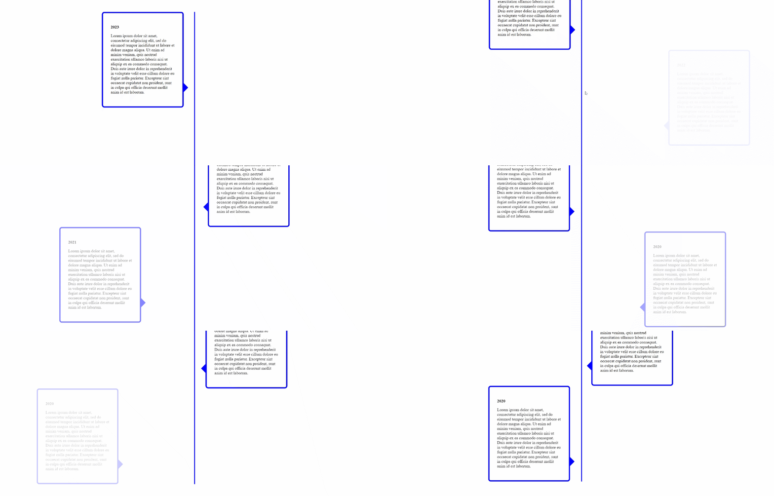
For instance, you can use it in a portfolio website to show your journey as a professional:
2020 — Graduated from XYZ University
2021 — Joined a brilliant startup
2023 — Promoted to Senior Developer
Or you can use it in a landing page to describe an organization’s history and culture:
1994 — Amazon was founded in a garage
1997 — Amazon IPOs at $18.00/share
1998 — Expands beyond books
HTML
A container div that contains:
- The central vertical line
- Cards positioned to the right
- Cards positioned to the left
<div class="container" id="container">
        <div class="line"></div>
        <div class='left card'>
            <p><b>2023</b></p>
            <p>Add your text here</p>
        </div>
        <div class='right card'>
            <p><b>2022</b></p>
            <p>Add your text here</p>
        </div>
        <div class='left card'>
            <p><b>2021</b></p>
            <p>Add your text here</p>
        </div>
        <div class='right card'>
            <p><b>2020</b></p>
            <p>Add your text here</p>
        </div>
        <div class='left card'>
            <p><b>2020</b></p>
            <p>Add your text here</p>
        </div>
    </div>
CSS
We shall keep the line centrally positioned relative to the container div by using the relative and position:absolute classes. For the cards, the container will behave as a column flexbox using the flex-direction:column property.
.container {
    margin: 50px auto 100px;
    position: relative;
    display: flex;
    flex-direction: column;
    flex-wrap: nowrap;
    justify-content: center;
    align-items: center;
    width: 100%;
    overflow-x: visible;
  }

.line {
    width: 4px;
    background-color: blue;
    height: 100%;
    position: absolute;
    left: 50%;
}
The card class applies a simple border and sets the initial opacity to 0. We will use the transition property to fade it into full opacity and to move it towards the center smoothly.
/* opacity 0 because it should start off invisible */
.card {
    transition: 0.3s;
    border-radius: 10px;
    min-height: 100px;
    width: 250px;
    opacity: 0;
    position: relative;
    border: 5px solid blue;
    transition: all 2s ease;
}
We will need a left and right class that controls the positioning of the card element. These classes have an initial transform of 100% and -100% since we want them to start moving in from the left or right. Using these classes as selectors, we'll display arrow heads with the ::after pseudo elements.
.right {
    padding: 30px;
    margin-left: 400px;
    transform: translateX(100%);
}

.left {
    padding: 30px;
    margin-right: 400px;
    transform: translateX(-100%);
}

/* Arrow heads */
.card.left::after {
    content: '';
    position: absolute;
    right: 0;
    top: 80%;
    width: 0;
    height: 0;
    border: 22px solid transparent;
    border-left-color: blue;
    border-right: 0;
    margin-top: -22px;
    margin-right: -22px;
}

.card.right::after {
    content: '';
    position: absolute;
    left: 0;
    top: 80%;
    width: 0;
    height: 0;
    border: 22px solid transparent;
    border-right-color: blue;
    border-radius: 10px;
    border-left: 0;
    margin-top: -22px;
    margin-left: -22px;
}
JavaScript
The IntersectionObserver API will allow us to fire a callback whenever the cards come into the view of the screen. This callback will kick off the animation of fading the opacity back to 1 and moving the cards in from the left or right by setting the transform to 0.
function initObserver() {
    const observer = new IntersectionObserver((entries) => {
        entries.forEach(entry => {
            if (entry.isIntersecting) {
                entry.target.style.transform = "translateX(0)"
                entry.target.style.opacity = 1
            }
        })
    }, {
        threshold: 0.8 // Fire the callback once 80% of the card is visible
    })

    let cards = document.querySelectorAll('.card')

    cards.forEach(card => {
        observer.observe(card)
    })
}

//Attach the interesection observer after the window loads
window.onload = initObserver
Mobile Responsiveness
We can add a couple of media queries in our CSS file for smaller screens to
- Reduce the width of the card
- Reduce the margins
- Bring the initial position of the cards closer to the center
- Reduce the font size
@media only screen and (max-width: 768px) {
    /* left to right doesn't work on some smaller screens so
          both cards will have right -> left animation */

    .left {
      transform: translateX(20%);
    }

    .right {
      transform: translateX(20%);
    }

    .card {
      max-width: 25vw;
    }

    .left {
      margin-right: 300px;
      padding: 20px;
    }

    .right {
      margin-left: 300px;
      padding: 15px;
    }
  }

  @media only screen and (max-width: 600px) {
    .card {
      max-width: 19vw;
    }

    .card p {
      font-size: 7px;
    }

    .left {
      margin-right: 200px;
      padding: 20px;
    }

    .right {
      margin-left: 200px;
      padding: 15px;
    }
  }
And that’s it! You’ve got yourself a simple timeline animation that doesn’t use any external dependencies. Here’s a working demo.
